

Alquimie

Released quarterly as a printed magazine, Alquimie is a modern independent publication, and shares the culture and stories behind the drinks we love.
Covering wine, beer, spirits, bitters, coffees and other solutions of interest; Alquimie explores the liquids themselves — their origins and stories. Nicholas was involved from the inception of the publication — from naming, through to the identity design, publication design and art direction of the imagery.


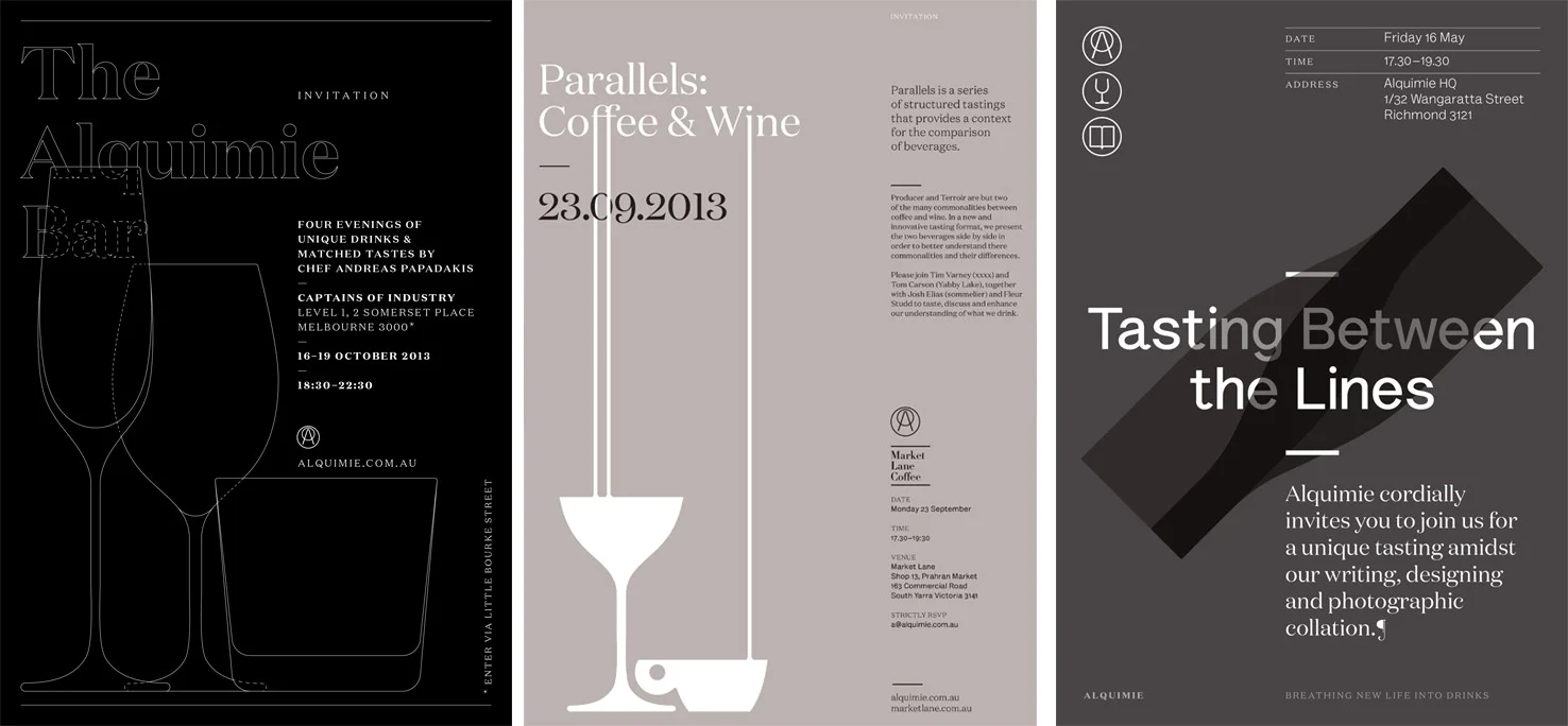
The identity consists of two parts: the logotype which acts as the masthead of the publication, and the marque. The classical serif Domaine (by Klim Type Foundry) is utilised for the logotype, with a wide spacing between the characters to ensure the legibility whilst the publication is on-shelf. The marque was formed from the concept of placing a glass on a coaster to form an uppercase 'A'.
A set of icons were also developed to link to the different types of drinks which Alquimie covers, as well as neon signage for events and glassware with the marque on the pour line.


